[DES212] VISUAL COMMUNICATION & CULTURE | TASK 2 | THE FUTURE OF PRINT
This assignment was an introduction into designing a physical publication using software [Adobe InDesign].
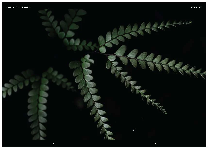
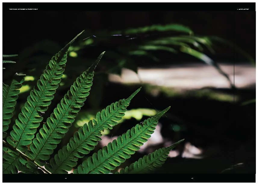
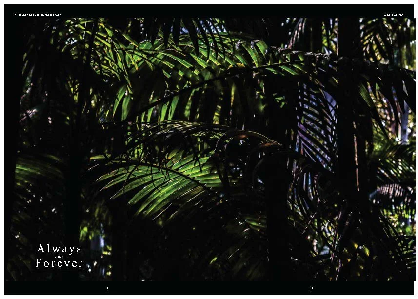
My previous experience with designing Idiosync issues made me comfortable trying something different and expanding my capacity for publication design. I chose a more ‘high-quality’ aesthetic style that highlighted plant species in the Buderim Forest Park reserve. I was particularly pleased with the synergy of the photography and the white-on-black style of the piece.
During the process I was more enthused by the appearance of the publication and rendering it well that certain shortcomings with the type weren’t recognised, such as hanging words. Staff feedback, however, made me aware of these. The overall cohesion could have been much better. Adding text segments throughout the entire booklet would have given it a more finished feeling.
Overall I’m content with the outcome as well as producing higher quality designs in the future.


GRADE - Distinction - 75%

FEEDBACK:

“Marley, overall, you have chosen an interesting topic. You’ll find I’ve made some notes within your submission.
When using the lower portion of the grid as a design feature, be sure to align the body copy along the bottom of the column. Additionally, as a design standard, avoid orphans and widows.

As an industry tip, consider turning off hyphenation for body copy in a publication.

Your typography choices work well. However, your page numbers were out of order, and some spreads felt incomplete.
Be sure to proofread carefully and pay attention to all the details. It’s also helpful to have someone else review your work.

I look forward to seeing your Task 3.”